Rec. sizes
Font
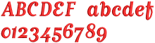
Sample
Min
Max
JM
Use
in.
mm
in.
mm
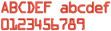
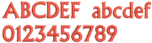
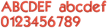
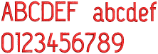
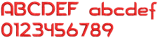
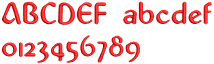
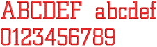
Font Pack #1:
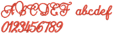
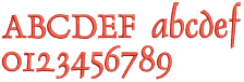
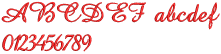
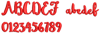
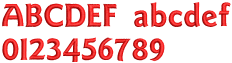
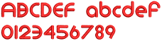
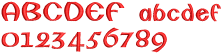
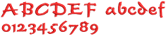
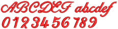
Eliza
1.4
35
2.2
55
CJ
When you need a wide baseline font with a larger size range.
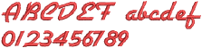
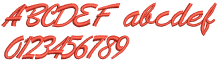
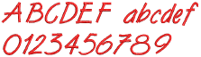
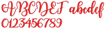
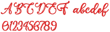
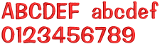
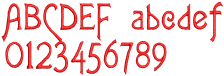
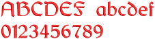
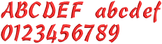
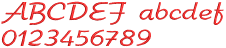
Handy Script
0.8
20
2.0
50
CJ
When you need a narrow baseline. Use for medium size letters.
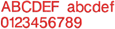
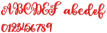
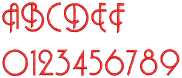
Memo Script
0.4
10
0.6
15
CJ
Easy-to-read script for small to medium size letters.
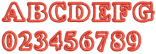
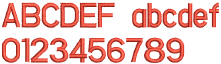
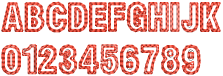
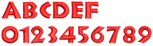
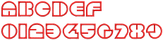
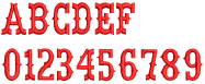
Font Pack #2:
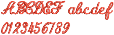
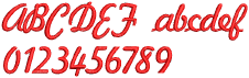
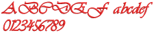
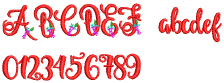
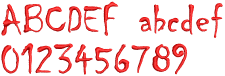
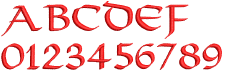
Henriksson
4.0
100
5.1
130
AD
Designed to be used as single medallion type lettering. Uppercase only. Great for a monogram with fancy scroll effects.
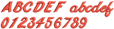
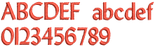
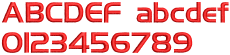
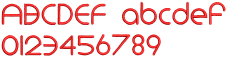
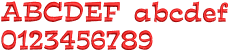
Microscan
0.3
8
1.0
25
CJ
Crisp and clear letters for small size fonts and a narrow baseline. Includes upper and lowercase letters and numbers.
Glory Appliqué
1.2
30
1.6
40
AD
Uppercase alphabets and numbers to use as appliqué or not. Medium to tall size letters.
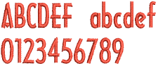
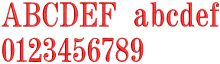
Lydian
0.5
12
1.0
25
CJ
Uppercase and lowercase letters. Great for small letters such as initials on collars or cuffs. Add a slight slant in the software and almost create a calligraphy look.
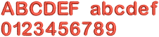
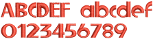
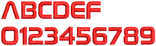
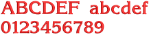
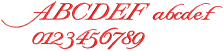
Font Pack #3:
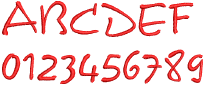
Architect
0.5
12
1.4
35
CJ
Small to medium size with a narrow baseline.
Flares
0.3
8
1.0
25
CJ
When you need a bolder but narrow baseline. Has a slight ‘flare’. Designed to stitch well when smaller letters are needed.
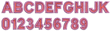
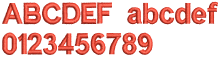
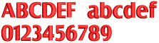
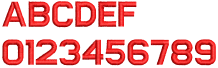
Utility Block
0.4
10
1.1
28
CJ
When you need a bold and wide baseline font with a large size range.
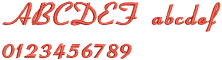
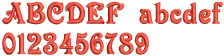
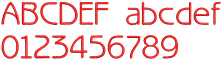
Font Pack #4:
Arial Rounded
0.4
10
0.8
20
CJ
This is perfect for a modern look.
Empress
0.8
20
1.4
35
CJ
Perfect for a fancy slanted look without a script font.
Border Block 2
0.6
15
0.9
22
AD
All upper case letters in a two-color block.
Font Pack #5:
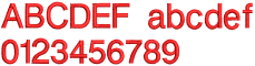
Helvetica Small
0.3
8
1.0
25
CJ
Perfect for a very small size block font and writing text.
City Script
0.3
8
0.8
20
CJ
Slanted modern script great for larger size letters. Slant can be removed with Hatch’s ‘slant’ feature by reducing to less than zero.
Dauphin
0.6
15
1.2
30
CJ
Perfect fancy block style and great for special occasion gifts.
Font Pack #6:
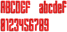
3D Block2
0.7
18
0.9
22
AD
Block fonts are the most popular font style when using puffy foam. Perfect for backpacks, sports bags, caps. Use 2-3mm puffy foam with this font. This font will stitch as digitized, without closest join, to preserve the look.
3D Brush Script
0.8
20
1.0
25
AD
Brush Script provides a handwritten feel with the artistic flair of brush and ink. 2mm foam recommended with this font. This font will stitch as digitized, without closest join, to preserve the look.
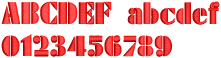
3D Monoglyceride
0.7
18
0.9
22
AD
Bold, upright, sans serif, rounded. When you need a block look but want something a little more modern, try using Monoglyceride font. Use 2-3mm puffy foam. This font will stitch as digitized, without closest join, to preserve the right look.
Font Pack #7:
Advent
0.3
8
0.8
20
CJ
Great to use for wall art and backpacks. This is a medium size font and should not be used above 2 inches (50mm) unless you turn on Auto Split or Embossed Satin.
Kabel
0.3
8
1.0
25
CJ
Gives you a book print look. It’s readable at a small size of 0.25 inches (6mm). It looks great when used with the circle baseline to give a curved look to your project’s lettering.
Swiss Run Hollow
1.0
25
4.0
100
AD
Upper case only, this font is great for a hand-stitched look. Works well with larger lettering up to 4 inches (100mm). In order to retain the hand-stitched look, should be stitched ‘as digitized’ and not as ‘closest join’. This font is fun to break apart in Creator or Digitizer product levels and play with adding different outlines and multiple colors.
Font Pack #8:
Locker
0.4
10
0.6
15
CJ
Works well when stitched in white-on-black to give a blackboard and chalk look. Great for short phrases and wall art. The maximum recommend height prevents satin stitches becoming too wide.
Victorian
0.3
7
0.6
15
CJ
A great font for that ‘vintage’ look. Combines well with mixed font types. Perfect for simple signs, wall art, and single name projects. Try using a larger first letter for a different look.
Western Serif

0.25
6
0.8
20
CJ
This is an upper case font and combines well with sans serif block fonts. It has bold satin serifs that give it a classic look in many styles.
Font Pack #9:
Capsule
0.4
10
2.0
50
CJ
Easy to read when using all caps or upper and lower case mixed. Great for wall art and sayings and sign art.
Drake
0.5
12
2.0
50
CJ
Think of this style as ‘lively and fun’. It has a little slant and a wider range for height.
Yama
0.25
6
1.2
30
CJ
This is one of the most popular fonts in both embroidery and print. It’s a beautiful block font with a wide size range.
Font Pack #10:
Lila
0.5
12
1.2
30
CJ
Short height with capital letters that are a bit funky. You’ll enjoy using this font that is a little on the heavy side and still readable.
Python Script
0.8
20
1.4
35
CJ
A little on the vintage side, but quite modern, this font is great to use when you want a slight calligraphy look.
Vivid Script
0.5
12
1.4
35
CJ
Bright, bouncy and glowing is how we describe this font. Looks good at ½"–2".
Font Pack #11:
3D Foam Emphatic
1.2
30
1.4
35
AD
This font recalls the kind used with handwritten crossword puzzles. It makes nice bold block fonts when used with foam.
3D Foam Futuro
0.6
15
0.7
18
AD
To get that stencil look, this is the font to use.
3D Foam London
0.8
20
1.0
25
AD
Clean lines, yet with a sophisticated look, this is what you’ll get with the London font when combined with foam.
3D Foam Sofachrome

0.4
10
0.5
12
AD
Want that ‘techno’ look? This font will give you just that when stitched out with foam.
Font Pack #12:
Script Love
0.8
20
1.4
35
CJ
Large letters for towels, robes and baby blankets.
Script Union
1.2
30
1.4
35
CJ
Medium sized letters for a personalized touch.
Script Wisdom
0.6
15
0.7
18
CJ
Smaller letters for initials for sentimental markings.
Font Pack #13:
Mono Contour
1.6
40
3.2
80
AD
This is a narrow font that has single run decorative shadow lines, giving a calligraphic look to the letters.
Mono Fuchsia
1.6
40
1.7
43
AD
This satin font has a decorative swirl with an outline flower. Great for monograms.
Mono Swirl
1.2
30
2.0
50
AD
This font has swirls in the background of the upper case letters. Great for monograms. You can use this up to 50mm.
Font Pack #14:
Bonbon

0.4
10
0.8
20
CJ
This font has a curved edged box style. Great for futuristic look.
Circulate
0.4
10
1.0
25
CJ
Great for fun and playful sayings.
Indigo
0.4
10
0.7
18
CJ
Fluid but clear style. Great for soft futuristic look.
Font Pack #15:
Informal
0.25
6
0.4
10
CJ
A bold font in all capital letters that can be used at a small sizes down to 6mm. Remember to increase letter spacing at smaller size ranges.
Lazer
0.25
6
0.7
18
CJ
Use for children’s and school projects. Give that look of outer space.
Sofachrome

0.16
4
1.4
35
CJ
Gives you a modern headliner look. It can be use at small heights down to 4mm. Remember to increase letter spacing at smaller size ranges.
Font Pack #16:
Bravo
0.5
12
1.6
40
CJ
A decorative look with an organic feel. Flared stroke at the ends works well when using a 15° slant.
Goudy Sans
0.3
8
0.7
18
CJ
This font works well up to 40mm. Use where you want taller letters but keeping a narrow satin look. I has a comic feel.
Legal Block
0.25
6
0.8
20
CJ
The name says it! All caps where you want that traditional block look.
Font Pack #17:
Handel Gothic
0.3
8
0.7
18
CJ
Clean and consistent flowing font. Use for titles, names where you want a bold medium size look.
Impress
0.3
8
0.8
20
CJ
Versatile font. Works at small size as small as 7-8 mm on many fabrics. Easy to read and a favorite to use.
Monoglyceride Bold
0.4
10
0.6
15
CJ
The lowercase letters are taller than the average font but still shorter than the uppercase.
Bold and easy to read.
Font Pack #18:
Agatha
0.4
10
0.8
20
AD
Gives projects a handwritten look.
Pixie
0.5
13
1.0
25
CJ
Looks like it was drawn by hand using a thick marker. Use for children’s and fun projects.
Thriller
0.6
15
0.9
23
CJ
This font is quite ‘chilling’. Use for a hand-drawn appearance. Great for Halloween projects.
Font Pack #19:
Columbo
0.4
10
0.7
18
CJ
Great to use for children’s projects.
Monoglyceride
0.4
10
1.2
30
CJ
Lower case letters are taller than the average font but still shorter than the uppercase. Semi-bold and easy to read.
Toon
0.4
10
0.6
15
CJ
Works well for medium sized fonts where you want a bold look but keep the text small and easy to read.
Font Pack #20:
Gaelic
0.4
10
1.0
25
CJ
Use to give that edgy look used in medieval manuscripts.
Olivia
0.3
8
0.8
20
CJ
Looks good in small sizes.
Viking
0.4
10
0.8
20
CJ
Good for logos, wall art and creative projects.
Font Pack #21:
Free Style
0.4
10
0.8
20
CJ
Give a handmade uneven brush writing look to your projects.
Pageant
0.6
15
2.0
50
CJ
Also looks good when using a slant.
Westminster
0.4
10
0.7
18
CJ
Looks good as single line or multiple line text.
Font Pack #22:
Discoteque
0.6
15
1.6
40
CJ
Use when you want to 70-80s disco look.
Futura Outline
0.6
15
1.2
30
CJ
Great for logos when you need a bold look without all the stitch count.
Outline Block
0.7
18
1.4
35
CJ
Use for medium height lettering.
Font Pack #23:
Cecilia
0.4
10
1.0
25
CJ
Perfect for single name projects when you want a bold script.
Karin Script
0.4
10
0.8
20
CJ
Use for special occasions or to give that elegant look.
Western
0.4
10
0.8
20
CJ
Works well for medium height lettering.
Font Pack #24:
Centurion
0.7
17
1.4
35
CJ
Looks good with multiple lines of text that is at least 17mm tall giving a British look.
Civic
0.4
10
1.4
35
CJ
Works for many situations. This font looks great with a 15 degree slant.
Wild West
0.4
10
1.0
25
CJ
Fun to use for signs, saying, wall art.
Font Pack #25:
Krone
0.3
8
0.7
18
CJ
Use if you would like to have a hand lettering look from the early 20th century. Can be used in small text at least 8mm.
Lorenne
0.8
20
1.2
30
CJ
Use for weddings, invitation, quotes and logos.
Matrix
0.4
10
0.8
20
CJ
Use for wall art, name displays, and monograms.